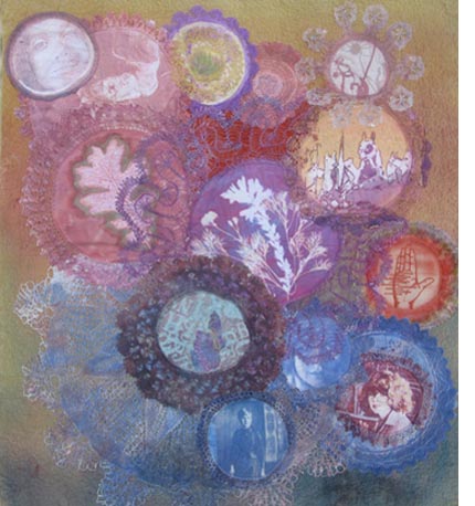
 For this art quilt, doilies that had been collected over the years were dyed individually, then sewn onto cloth I had painted. The images were all produced with light-sensitive dye, most of them by rolling SolarFast dye onto the cloth and exposing in sunlight with a negative — some are Kodalith film negatives that I made years ago in my darkroom, some were created in PhotoShop Elements and printed on inkjet transparency material recently. One image was made by placing pieces of plants directly on the wet dye, and one was made with plastic stick-on letters instead of a negative.
Most of the images are from my photographs and scans; some have been altered to be more graphic. Two are appropriated, one from a vintage photo found in a thrift shop and one that was scanned from a 1930s book. The picture on the upper right (looks a little like mountains) is stylized merry-go-round horses, painted with dye.
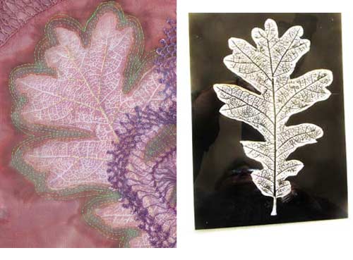
This was a scanned leaf that was altered in PhotoShop Elements with the “stamp” filter to emphasize its lines. On the left is the final print; on the right is the negative that was used. It was printed on my inkjet printer.
After exposing the cloth with a mixture of violet/brown SolarFast, there wasn’t enough contrast, so I painted around the edges with grey/green and then with a darker mixture of red/violet.
Green threads were used to outline the leaf with quilting. (The purple lines are the lacy edge of another doily.)
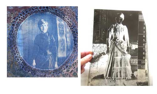 This vintage photo was photographed and made into a high-contrast negative in the darkroom. When I exposed the doily with blue SolarFast, I left it too long in the sunshine and was disappointed because the image was very dark. Then I turned the doily over and saw that there was a nice image showing on the back, although it was too light. So the cloth was recoated with blue and the negative was flipped over and carefully placed on the existing image on the back of the first print, to be exposed again for less time.
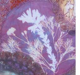 A mixture of SolarFast blue and red was painted onto the large doily in the middle of the art quilt, shown in the detail here, and then stems of plants from the garden were placed directly on the damp dye. A piece of glass kept the fronds in fairly close contact with the cloth and it was placed in direct, strong sunlight. You need to be careful to keep the piece at a consistent angle to the sun while exposing because you don’t want sunlight to creep under the edges of the plants and soften the edges of the image. This is true when you are using a negative as well, but is especially important when using objects with some depth. I like to mix the dye colors, and because the SolarFast dye has very little color until exposed, the results are sometimes surprising, but I usually like them.
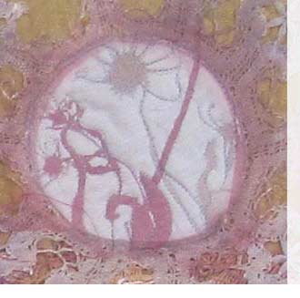 This image was made by two separate exposures after the cloth had been coated with a combination of violet and black Solarfast. The negatives were made in the darkroom by placing the thistles directly on the film, and the negative images are very sharp. (You couldn’t get that sharp an image by scanning thistles because they are so three-dimensional. You would have to work from very clear photos.)
The negative for the thistle in the middle was given a shorter exposure, then the negative was removed and replaced with the second one, which was given a longer exposure.
To make the lacy edges dark enough, a round piece of black plastic was used to mask the center. You can see where it curled up a little and part of the cloth was further exposed around the edges.
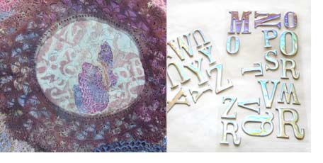 The letter shapes on the right are shiny, silver stick-on letters that come on clear sheets of acetate. The doily on the left was exposed with those sheets instead of with a negative.
The pale blue happened because I didn’t wash out unexposed dye on the doily carefully enough, an important step. (I liked the old, torn cloth in the middle that shows the layers underneath.)
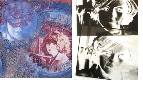 The The negatives on the right were used to create the blue face image (partially covered by lace). Working from the original 35mm negative, I gave the high-contrast film different amounts of light in the darkroom. The detail in light parts of the face comes from the bottom negative that lets in more light. Then I used the top negative and gave it more time, making parts of the image darker.
The other doily (also my friend Clare), had diluted fabric paint added after washing out unexposed maroon dye.
My next post will be on how to create negatives with image software and print them out on transparency material — from choosing an appropriate photo to a little information about printers. Although I have described here how I made film negatives in years gone by, I now work with PhotoShop Elements (a fairly inexpensive version of PhotoShop), and that’s what I will be demonstrating. It can all be done with home inkjet printers. After that, I plan to finish up the posts on light-sensitive dye by showing the exact steps for creating a photo image on cloth with a photo negative, from mixing the dye to the important washing-out step.